i am thinking about using apples for my last print project. this is the shape of the apple i would like to use, but i'm not sure what twist i want to put on it.
Monday, April 16, 2007
apples.
i am thinking about using apples for my last print project. this is the shape of the apple i would like to use, but i'm not sure what twist i want to put on it.Thursday, April 12, 2007
rectangles.
 today i saw a girl on campus with an extremely bright and tacky shirt. the stripes on it were horribly loud. i made a mental note as she walked by.
when i got home, i opened illustrator to play. this is what i made. no story to it. it's a wysiwyg. what you see is what you get: rectangles. these are the colors of the stripes that were on the girls icky shirt.
Wednesday, April 11, 2007
picking up my camera.
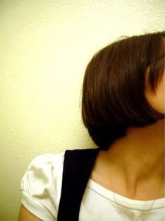
 this is another picture of myself that i played around with. once again, i used filters. i like what some of them do, but i would never use them for anything that i planned on turning in for school. never.
legs.
 i took a picture of my legs the other day when i was trying on my new pair of shorts. yes, i am one of those girls who likes to try on her new clothes when she gets home resulting in a mini fashion show.
back to the picture: my teachers always tell us to just say no! to filters in photoshop, but i've seen some pretty cool things done with them, so I started playing around with the picture of my legs and this is what i got. someday i will do this the right way in illustrator.
Tuesday, April 10, 2007
iheartmg.com
 this is a flash site that i am making for my web class. my assignment was to design a site that was about my assigned designer, milton glaser. glaser is known for his famous bob dylan poster and probably one of the most popular logos, the i heart ny logo. i had to base my site design on one of glaser's pieces, but i didn't want to do the two obvious choices. i wanted to call attention to some of the other designs that he has made that haven't gotten as much attention, so i chose to base this design off of his saratoga poster. this is the first draft of my design. all of the content is going to go in the biggest circle and i will be moving the navigation into the circles that are on the left of that. after speaking with my teacher, i've noticed some things that need to be fixed and he would like me to make glaser, the man in the design, a black silhouette with colorful hair like the dylan poster that i did not want to address at all. i'm not too happy about that, but as an aspiring graphic designer, i have to learn to please the client, yes? yes. i will post the final design and a link to the site when i finish. i'm hoping for this to turn out nicely.
lowercase.uppercase
i'm jenn. i like to type in lower case letters. do you know why they are called "lower case letters?"
let me tell you a story:
back in the day, before the wonderful worlds of typewriters and computers, there was a thing called mechanical printing. this is the process type setters would use to create words, sentences, and paragraphs that were to be pressed into paper to create things such as newspapers and books. to do this, they would combine wooden or metal blocks that had one letter each. Those letters, being both uppercase and lowercase, were kept in a case, one being above the other. can you guess which part of the case each were stored? the upper case letters were kept in the top drawer (the upper case) and the lower case letters were kept in the bottom drawer (the lower case).
i'm jenn, i'm a graphic design student, and i find things that most people would find boring to be terribly interesting.
Subscribe to:
Posts (Atom)